Call to action (CTA) is a conversion marketing term used extensively in advertising and selling.
You can be the well-known company with unique products and services, perhaps you even have the best content. But what is the point of all this if you do not know how to designt a perfect call to action button?
Today, you will receive not just a set of tips; you will receive a step-by-step guide to creating an effective call to action button, after studying that you are guaranteed an increase in conversion at times. This guide was created by F5 Studio conversion marketing specialists who provide conversion rate optimization services.
Does your “call to action button” really work?
Have you ever asked yourself if your Call-To-Action (CTA) button works properly? At first, it may seem that creating a call-to-action button is a very simple task. However, there is more to it. In order to get the intended result, you need to understand the psychology of users.
Some people believed that the Call to Action button is just a button that has various shapes and sizes. But In practice, the call-to-action button is one of the most important components of the website which can turn a simple user into a client
Call to action definition: “Download file”, “subscribe to news”, “buy”, or “register” are all calls to action on the site.
The main purpose of the call to action button is to be attractive in appearance and well written.
The CTA consists of 2 elements: design and text.
The design is the visual aspect of a button that should attract the attention of visitors. It answers the question: “Where do I need to click?”.
The text should convince users that they want to do it right now. The question he answers is: “Why should I press?“.
You will be able to create the perfect call to action only after you have understood and applied what we will discuss here.
Step 1. Create an effective design
The choice of Colour
Bright colours help us explore the world around us. It turns out that we are able to receive signals through colours and unconsciously process them. Is it true that a certain colour affects conversion?
According to a survey conducted by “Hubspot” colours such as green and red can drive more traffic to the website.
Studies have shown that in term of conversion, the red colour was higher with about 21%. This figure is quite reasonable, considering that the red colour attracts more attention. More information about using colors in web design.
The design location
What kind of conversion can we talk about if users cannot find the action button?
When deciding on the location of the Call-to-Action, use one of these two approaches:
- At the top of the page (users do not need to scroll through it)
- At the bottom of the page (users will scroll through it)
Which option to choose?
If you have a long sentence, then place a call to action at the bottom of the page.
As the ContentVerve study showed, if you place a complex CTA at the bottom of the page, you will attract 304% more conversion compared to the one at the top. Place trust triggers next to the call button. The confidence factors increase the reliability of the appeal and have a positive effect on the growth of conversion.
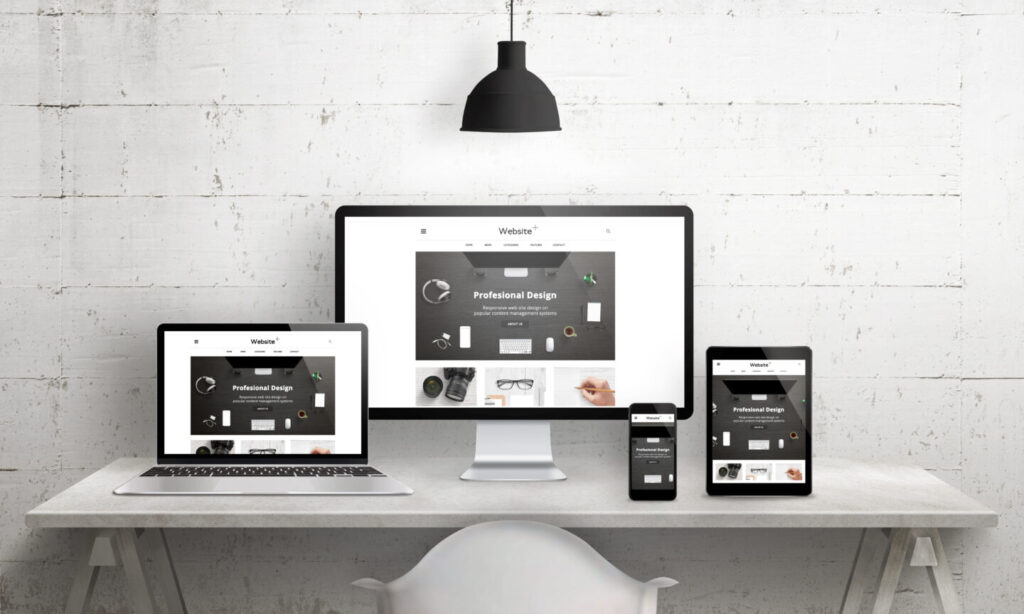
So where should the is the CTA be placed? Test the page and find out what suits your audience. Professional web design services include CTA design tests.
Do you want to get perfect call-to-action from professionals of UI/UX design? Contact Us
Step 2. Write an effective text
Now that you have figured out how to make the design, let talk about the text of your Call-to-Action button.
Say no to boring texts!
When writing the text, do try to avoid familiar expressions like download, send, subscribe. These words are boring and do not give any idea about the benefits for customers. Rather use storytelling.
Emotion-based stories are best sellers. If your site does not bring the desired conversion, then apply Emotional marketing. Use Emotion to make your audience notice, remember and buy.
On his ConversionXL blog, Tommy Walker writes:
“Do not think that by changing the button from“ Buy Now ”to“ Register here ”at the bottom of the page, you will see at least some changes, if everything that leads to this final call to action does not arouse the reader’s anticipation. The effectiveness of calls to action does not depend on the choice of labels on the button. The best CTAs promise that the story will become even more interesting if the user presses the button.”
A good example of a WordPress site:

The button contains two simple words: “Get Started” However, these words are part of the story, they invite users to participate in an exciting and productive process. This is how CTA works.
Step 3. What to note?
Do not be afraid to be interested in the users themselves, which button will be decisive for them to make a decision. Test, conduct polls, interviews.
Before you start creating a CTA,
Answer the following questions:
- Why would users want to click a button?
- What benefits will they receive as a result?
Answering these questions will help create the best Call to Action button and get the desired result.
Call-to-Action Examples that really Generate Leads
Calls to action (CTAs) have become an important part of the web. They are everywhere to tell us what exactly to do: buy a book, download a free manual, contact us for more information, etc. Sometimes it looks like cheap marketing, written and designed by people cut off from reality. Such examples often have the opposite effect. But what makes a CTA good and effective? We collected 10 examples of calls to action with a cool design, correct text, or simply designed wisely.
Laptopnuts
The main goal of the project was helping people to identify this site as the best place to sell or to buy used tech. That is why F5 Studio’s lead UI designer decided to use a hot design style that is known as NEUMORPHISM. It is great case shows how experienced web designer can combine design styles to create best call to action buttons. You can see the full presentation of our project.

MailChimp
MailChimp shows a great example of CTAs. It has many good examples of call-to-action buttons, but the best one is the ” Prepare for lunch” dialogue box, which registers you for an email campaign.
Even if the window were completely devoid of text, the animated image of the finger hanging above the button would unequivocally tell us what to do. It’s simple, fun, and by clicking on the “Send Now” button, you will experience a sense of completeness.

Managewp
ManageWP turned most of its homepage into CTA. The title and description clearly and concisely describe the type of activity the company does, and simply ask to leave your e-mail address to begin. The visual part is interesting, and the content hits right to the point.

Blue Apron
The Blue Apron site essentially consists of a whole series of CTA. This series of sections in a simple and well-readable form talk about what they offer and how much it costs.
The cherry on the cake was a cute free delivery icon. And of course, the background of fresh food and mouth-watering ingredients plays its role.

Spotify
As well as Blue Apron, Spotify shows how simple CTAs prevail over flashy ones, by just pacing two buttons on their page. These to Calls to action push you to sneak in or press a button for more details. Spotify does not try to surprise you, they just make it so that it is as easy as possible to log in and read more.

Zillow
Zillow is a place created for searching, renting and leasing real estate. On the first page of the site, you will find the CTA area, which allows you to do all of the above. Right from the start page, without the need to go somewhere and look for something. This is the most useful option to use calls to action.

B & O Play
Branching off from “Bang and Olufsen”, the B & O Play website continues the minimalist design and branding style of the parent site. The site is rich in beautiful industrial design, and calls to action offer to see the entire collection of these wonderful headphones, or buy this pair.
You might be thinking that there is nothing special about this CTA. However, the main idea that we want to emphasize in this example is that Call to actions (CTAs) are an important part of your design and brand as a whole, and they should reflect what you do and how you do it.

Mercy Corps
When it comes to important and difficult situations, Mercy Corps is a great example of how the CTA should be. The photo, supported by a serious, catchy title underlines the importance and severity of the situation.
The design helps to see people in trouble and encourages action.

Nest
Nest home automation wizards celebrated Earth Day, calling for energy savings. This message was depicted using an energy-saving thermostat.
Against the backdrop of the starry sky, designers have placed a huge image of the product. It makes an impression and resembles a planet floating in space. By the way, the star background perfectly creates the effect of air and space.

Skagen
Skagen is a Danish company selling minimalistic watches and other accessories. CTAs on their website are made in excellent colours and emphasize the simple style of the product. This teaches us this: if you have a unique product, let it speak for itself.

Patagonia
Patagonia is a travel site. On the main page, you will be greeted by a slider that has collected products and stories in the subject. For example, the screenshot below offers a movie about nature.
The image is large and attractive. From it breathes wildlife. It fits perfectly into the target audience.

CTAs for clicks
While designing a CTA, you should take into account the target audience and the interests of the user. Colours and images should reflect your brand and convey meaningful messages. Only use animations if they are relevant. The text should be succinct, short and strictly on the case.
The above call-to-action examples fulfil their intended purposes and in an efficient way. They prove that you do not need something verbose or difficult to lead the users to the actions you want.
But CTA is a part of web page design.
F5 Studio web agency will always provide you with marketing consulting about conversion rate optimization, UI/UX design. Get a call.