As UI UX designers, we know that it is important to protect web users. This means that we must avoid prejudices and focus on who we design for. The fact is, we design such a wide demographic of people, which includes the elderly.
Designing for older adults is a significant part of the modern UX design. Trends indicate that the population is aging and every year there are more and more elderly users for sites and mobile applications. Poor usability tends to affect older adults more often and more seriously than it affects young people. In ignoring this fact, you lose out on a ton of potential clients for your service.
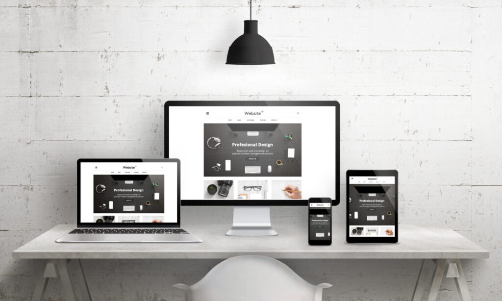
Making your design accessible and user friendly for older people is easy enough. From our recent project (iOS app design) our digital agency‘s UI/UX specialists will share a few simple rules with you that help to appeal to the older population. By specifically designing digital user interfaces with seniors in mind, you can drastically improve the user experience for everyone using your service.
Short-term memory, episodic memory, and concentration issues
Many people experience a decrease in cognitive activity with age. The speed with which older people process information slows with age. They can still do the same tasks, but it can take a little longer than young people. What does this mean in regards to design?
- Try to introduce product features gradually over time instead of all at once when possible
- Avoid multiple actions on one single screen; one focus at a time will have better results and be less overwhelming for your users
- Provide reminders and alerts as cues for habitual actions
- Use subtitles for any voice or video content
- Give clear feedback on progress and completion
- Make it clear (and easy) how to get back to the home page/start screen
Despite concentration issues, the elderly have much longer attention spans than younger people, so the use of long-form text and deep content is acceptable. However, you should avoid elements that can divert their attention.
We recommend that you imagine how people with slower processing of information and short-term memory issues will interact with your application.

iOS app design for seniors by F5 Studio
See the full presentation on our Behance profile
Vision issues
As people age, a number of negative changes commonly happen to their vision. Common age-related eye problems include presbyopia, glaucoma, dry eyes, age-related macular degeneration, and cataracts. In other words these changes make weaken your vision and can even be painful for your eyes. The most common of these problems is presbyopia.

Presbyopia is loss of the ability to see close objects or small print. Development of presbyopia is a normal process that happens slowly over a lifetime. People with presbyopia often hold reading materials at arm’s length. Some people get headaches or “tired eyes” while reading or doing other close work. These recommendations will help you to create a more appealing visual design for people with vision issues.
- No text overlaid on images or graphics
- Use font 16px minimum if possible
- Use fonts as Roboto, Helvetica, Arial, Futura, Avant Garde, Verdana
- Avoid using multiple fonts
- Make a clear content hierarchy with type weight
- Red & green are the hardest colors to differentiate for color blindness, so try to avoid text in these colors
- High contrast is the best solution
We recommend you to let people adjust text size themselves, if possible.
Older adults and technology use
These problems may also be characteristic of other demographics, however, older people are more likely to be faced with this issue. It’s more difficult for seniors to interact with tech things because it new and unusual to them.

You also need to keep in mind physical issues. The hand-eye coordination will slow down, motor skills tend to decline, and arthritis in fingers can greatly complicate the interaction with mobile applications. With that being said, you have to consider how elderly people will interact with your app or website.
- Provide clear instructions on how to use the app or website features
- Add reminders and alerts as cues for habitual actions
- Avoid abbreviations or acronyms
- Icons and symbols are less clear for elderly people, so with the use of symbols, always pair them with text
- Keep the scrolling simple and avoid displacement wherever possible
- Avoid incorporating gestures with quick movements, difficult positioning, or multiple gestures
- Increasing the size of buttons and distances on apps and websites commonly used by older people improves usability
We recommend making the purpose of the page or app clear. Also, elderly people must be able to quickly and easily get from start screen to the result that they are looking for.
In any case, it is better to use online visual impairment simulators and to convert designs to grayscale in order to make sure they are still legible.
Conclusion
Practice shows that up to 55% of older people actively use websites and mobile applications, however, they prefer to use devices with a touch screen. The most popular of these devices are tablets. The number of senior citizens constantly continues to grow, therefore, it is important to consider some specific features of the interaction of older people with design.
As you can see in this article, we have provided a few specific recommendations. Most recommendations comply with general UI UX design requirements, therefore, it will be simple enough to implement these recommendations and integrate them into your app or your business website. If you worry about redesign your app or website you can contact our experienced web development specialists